Web Designing Trends for 2018-2019
With the onset of the internet era, web design is that trump card which helps your business grab the limelight and stay soaked in success for years to come. Every business has its own goal and websites are the one that reflects your business identity. But having a website alone for a business will not work out, the one thing which attracts and impresses your visitor is, your website’s design. Yes, a good design communicates your brand and directs your visitors where they need to go and find the right kind of information.
Therefore, it is crucial for brand owners to be aware of the latest web design trends, learn new techniques, tools and implement them in practice to stand out from the competition and to offer the best user experience for their customers.
Since it is an immense work, do not panic. We are here to help you and compose your job simpler. Below are the latest web design trends that are going to take up even the next big tech year.
-
Original images earn the trust
According to scientific research, human brains analyze visuals faster than text. Yes, people easily get attracted to the product through its image. Therefore, it is indispensable for web designers to use high-quality images with good resolution. This approach not only to earn trust from your customers but also makes them think your products are good in quality.

Web designers who know the proper image usage can manipulate their audience to feel whatever they want them to feel. If you are introducing a product which is new, innovative or just different, images are the best way to showcase them. Therefore, optimize your websites with good images to show someone what to do instantly, and clarify their problems.
-
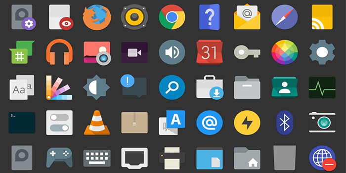
Well-customized icons
Icons are the symbol of a brand, and it should represent the uniqueness of the brand’s products or services. Nowadays, icons play a major role in web designing, and it must be elegant instead of boring to make the website attractive. Websites with proper handling of icons will increase the interactivity. Icons may be small in size but, it has the power to fascinate attention.

And it is very extensive to determine where an icon is needed to make it more effective. Using icons consistently across your web pages will ensure your identity. If you are providing different kinds of services, then the icons can help you to showcase your services without putting much effort. Therefore, as a web designer, make your icons work smarter and harder for your brand.
-
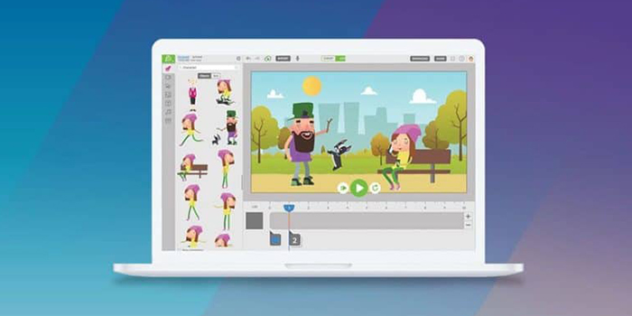
Content-based animations
The purpose of animations are,
To grab the visitor’s attention since its an inseparable interactive element
To prompt the user on how to navigate through the website correctly
Utilizing animations on websites become trendy as it can make the user interface intuitive and make it easier for the visitors to get around your website. But, one should perceive the purpose of animation before apply, since it can confuse and causes high bounce rates.

Although animations are great in purpose, overusing it could make the page really slow. In order to build your website responsive and quick, apply minimal effects. Proper animation effects on the website will grab the user’s attention and make them stay longer, thus, you can reduce the bounce rates.
-
Unique illustrations
What may be the main and the primary objective of a web presence? It attracts the user’s attention. Yes, in order to grab more users, you have to concentrate on things such as page speed, content quality, background color, high-resolution images, informative videos, infographic images, blog posts, animations, and etc. But sometimes you may fail due to some reasons. In that situation, a little creativity, color, and compelling illustrations help to change a website’s image and increase the impact it makes on your visitors. Unique illustrations make your website differ from others and help you to be unique on your own business objectives.
-
Color Combination Matters!
Choosing an appropriate color combination is an essential element in building a successful website. Pleasant colors grab visitors attention and 60% of acceptance or rejection of a website is tied to the combination of color. And it can make the visitor stay longer and visitor who stays the more increase the chance of enticing to take action.

Therefore, always give importance to the selection of background colors. For example, if you are a seller of environmental or ‘green’ products, it would not be appropriate to use colors like red or orange. Select a color which matches your products or the services you are offering.
-
Conclusion
Building a website is easy, but pulling customers towards your website becomes quite complicated, as there are remarkably high competitors for single products or services. So, in order to grab visitors, web designers should refresh the website when a new website design style is in season. Regular updates based on the current scenario will make your website stand out from conventional designs.
So what are you waiting for? Forget about the old designing trends and experience the ‘new’ with Jujubee Media!

Rajendran, the CEO and Founder of Sumanas Technologies is also an enthusiastic writer for years. He comes up with creative contents and comforts the readers with flawless SEO articles. In his free time, he enjoys by empowering people, to build an equitable and a socially just world. You can follow Raj on LinkedIn
