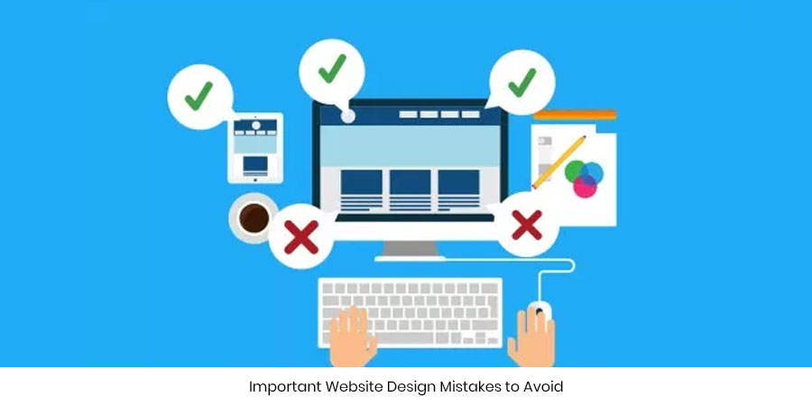
Important Website Design Mistakes to Avoid
The design is that aesthetic aspect of website development which gives a face to the millions of lines of code that lies deep beneath. When you visit a web page, the first thing that captures your attention is the ‘Design’! And by design we are not just limiting it to colors and text; we mean the cascading of functionalities. A website may carry most appealing of colors and the icons may seem to be talking the end user. However, if the page doesn’t help the user out visually to find what she needs then probably there is a mistake in the design!
So people usually tend to misunderstand designing to ‘drawing’. When you draw you make use of pens, paint, brush, pencil, and colors and come up with a close-to-reality version of what you see in real life. Web designing is more or less the same! Only that you will be using ‘PaintBrush’ instead of paint & brush to reflect your thoughts!
“How to design a website beautifully” or “how to design a website which appeals to end-user” are something for which one cannot definitely lay down ground rules or protocols. It actually comes with experience and a little bit of exploring.
Before you start out to find out what are the very common design mistakes that make a website look disheveled!
Content clutter
Many of us for getting all the users of the web onto their website, stuff all possible appealing content within their reach. One must know that a simple website with minimal colors and text can also do the trick! Stuffing too of much text or putting up images in every nook and corner could be a real spoiler!
Moreover, at times the font sizes and typefaces used by the designers in the name of ‘creativity’ could threaten the users. So keep your website as simple as possible. Give your visitors a visual retreat and even better functionalities. This is the key to a good design.
Color mismatch
‘Pink and Red’…this combination is banned in the world of fashion. However, a few like princess Diana pulled it off really well! Go for sharp colors & bright contrast if you can handle it really well. If you are a beginner try out basic color combinations that actually click on the Web. Make sure your color language is consistent.
Avoid too bright or flashy colors since it hampers ‘visibility’! Soft colors are always the best when it comes to web designing.
Messy Navigation
At times developers try to put in all their years of experience into a single website design. Websites seem to have buttons and textboxes everywhere. A flashy advertisement seems to be popping up every now and then. Moreover, the menus on the website are absolutely misleading.
Would you stick around such a website? Not even for a second…right!
Do not confuse your users. Your site navigation should be like a musical note; smoothly flowing and without quivers! A website with clean navigation is all it takes to a great design!
Some of the awesome websites on the World Wide Web come with minimal designing and maximum usability. Make sure your website is a blend of the two.
At the end of the day, designing is all about exploring! The more you explore the better!
In love with writing!
Jujubee media comes up with witty articles while including the pertinent information on what it’s best known for. We craft unique and credible content that helps in the best possible way to capture technological insights with ease!
Comments are closed.
Leave a Comment
sign in to post your comment or signup if you dont have an account.