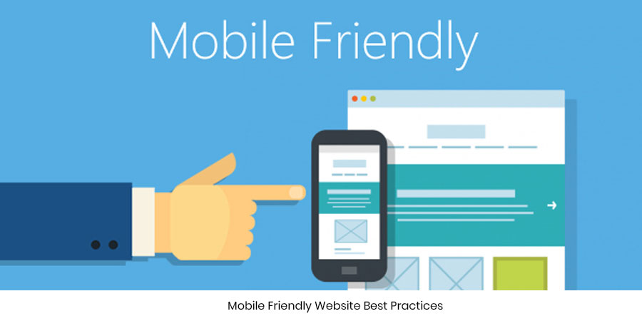
Mobile Friendly Website Best Practices
In this era of Smartphones, we are interested in retrieving apt information at speeds even race cars couldn’t bet! Everything has to be quick and in place. We type a keyword in Google and the answers show up within a matter of seconds.
Many a time we view pages which have misaligned text and overlapping buttons. When you view it on your desktop it seems to be absolutely fine! It’s because the web page was not optimized for the mobile phone. Simply put, the pages are not mobile friendly. The screen resolution of a phone differs sharply to that of a desktop. We need to make sure that our web pages are mobile friendly as well. Else we will be losing out on a huge audience base which is hooked to the mobile phone for answers every single second. If a user checks out a food ordering site on her Smartphone that is not mobile friendly it may be a total waste of time for the user. She may think twice before giving a visit to your site again. If the viewing is clear and uncluttered then she will bookmark your page on her mobile for future reference.
So you get to become your user’s favorite not only on the desktop but also on the mobile.
Google, therefore, is making sure that your web pages are healthy for mobile viewing.
It is adding a mobile-friendly label to the search results of pages which are fit for viewing on the small screen. This change that has been rolled out just a few days back by Google will allow users to distinguish between a mobile-friendly and not-so-friendly site. It’s then your choice whether to view the page or not. If you do then probably you will find hindrances in reading and finding the right information.
So how’s a page marked mobile-friendly?
A page is said to be mobile friendly if it happens to match the following criteria laid down by the tech giants…
• Makes use of text readable by the human eye
• Doesn’t have unnecessary software like flash
• Sizes that fit the screen and that do not have the need to scroll horizontally
• Links are placed at clickable intervals allowing users to select the right one
If your web page does all this on your mobile then it is sure to please the Googlebot. If not try fixing your site and optimize it to make it Google friendly.
If you want your web page to mobile-friendly do the following….
1. Take Google’s mobile-friendly test to check whether your site is mobile friendly or not
2. Check the mobile-usability report in the Webmaster Tool from Google
3. Keep yourself updated on tips from Google to improve your mobile-site performance and on the use of mobile-friendly templates.
The mobile-friendliness of a website will soon become a crucial parameter of ranking. Google makes sure, time and again, that their users get the best be it on the small screen or big!
In love with writing!
Jujubee media comes up with witty articles while including the pertinent information on what it’s best known for. We craft unique and credible content that helps in the best possible way to capture technological insights with ease!
Comments are closed.
Leave a Comment
sign in to post your comment or signup if you dont have an account.