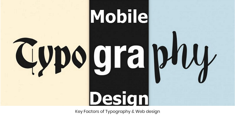
Key Factors of Typography & Web design
Will you be patient enough to read a blog with messy and unevenly spaced text? Definitely a NO! So what is it that makes an article or content readable online? Yes! it’s the text, font, and size…in short the Typography! To put it into simple words, if you are keen about conversions then you have to look into this crucial aspect as well. Typography is the artistic perception of a text displayed on a given layout. It’s how you look at a font and add flavors to it to make it more appealing. You might have read a hundred and one pages online. However, only a few get registered in your memory.
Possibly because of the awesome content or the font that’s making the content look really good! Typography has basically got to do with the placement of type.
Users landing onto a page tend to scan the font size, its color, shape, and placement. It is this that leaves a mark in the user’s mind. So how does this impact conversion? The answer is really simple. More the user connects with the content and its readability more is he assured of finding answers to his questions. If you give the reader what they want they would love to stick around your blog isn’t it? A little focus on the typography will take your conversions to a new high.
Before starting out it is necessary to know the key ingredients of typography…..
Typeface-Typeface is a group of characters carrying the same design like Times New Roman, Comic Sans
Font- A typeface bearing a specific width and size is called a font…12pt Arial is a font! Leading-The space between the baselines of successive lines of text
Leading-The space between the baselines of successive lines of text
Line length- Distance that the text between the right and left margin occupies
Keming-Whitespaces between characters or letters
Tracking-Adjusted space distributed over the character range commonly known as spacing
Each and every component impact the readability of text to a great extent
Typography is the Key!
At times businesses become lost. They are doing everything possible from PPC campaigns to SEO to get users onto their site. However, the smart at times overlook the obvious! Typography may sound very insignificant but it can make a big difference when it comes to improving the quality of your site.
Just assume a case wherein a user lands onto your site and is looking for information. If the text is impossible to read then either the user will use the exit door or struggle it out with the copy to get a catch of a few points present in the content.
Obviously, an exhausted reader will think twice before coming to your site. There end your efforts to retain users and make them your loyal conversions. So all you have to do is to make sure that your website carries well-spaced text, readable typeface, and stylish fonts.
Understanding typography is all that it takes to make your content look neat and presentable. So if you still haven’t worked on your site’s typography then possible this is the right time to start thinking about it!

In love with writing!
Jujubee media comes up with witty articles while including the pertinent information on what it’s best known for. We craft unique and credible content that helps in the best possible way to capture technological insights with ease!
