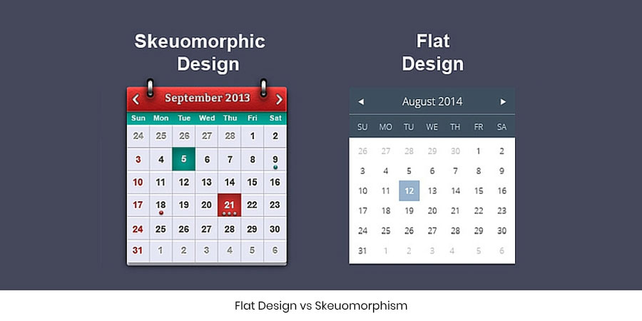
Flat Design vs Skeuomorphism
“Let’s go in for a flat design…I think skeuomorphism is better!”
These two core word have become the substance of almost any design discussion. “Should we go in for a flat design or a Skeuomorph design is better?” Designers often tend to sit for hours together to come to a conclusion on the choice of designing style. However, this debate if often unending.
Since both, flat design and Skeuomorph, comes with its own pros and cons. It’s up to the designers to adapt a befitting design which will reflect their brand in a manner appealing to the users.
Since both, flat design and Skeuomorph, comes with its own pros and cons. It’s up to the designers to adapt a befitting design which will reflect their brand in a manner appealing to the users. So what is a flat design and how does a skeuomorphic design help enhance the overall look of the website? Before going into too much detail, here’s a one line explanation to both!
Flat Design uses minimal design to express the core content of the website. However, a Skeuomorphism takes inspiration from real life and derives cues from objects in the living world. So a website with a Skeuomorphism is more realistic as compared to its counterparts which more of a graphical representation of the objects. To be more specific, objects in the flat design do not carry a three-dimensional view. A Skeuomorph design includes objects with a touch of 3D to give a more life-like look.
Flat design
Flat design makes better use of typography and colors. Usually, designers tend to prefer it over Skeuomorph since working with it is more organized and efficient as well. Users get to know at their first glance as to what the brand is all about. The colors, textures and objects of this design are appealing and at the same time simple. It makes interface designing easier for responsive websites and with minimal designs websites tend to load faster. The content looks more presentable and straightforward with flat designing.
However, flat design at times could confuse the users since the users may lose interest in the design much quickly. Moreover at times it becomes unclear to users as to what has to be clicked on the website which makes it difficult to communicate preciseness.
Skeuomorphism
Skeuomorphism, on the other hand, implements realistic designs to give the website a greater visual appeal. With this design type, users almost instantly understand the nature of the object. It has a higher appeal value since users tend to get attracted almost instantly to the design structure of a Skeuomorph. Since people tend to connect to real life objects much faster, Skeuomorphism overtakes flat design in the race to grab user attention. Moreover, Skeuomorphic designs are safer and time-tested by designers.
However, the real life illustrations and huge files can slow down the website performance. Since Skeuomorphism rely on images rather than CSS. The designing style of this category is restricted to a timeframe in which it is designed. The styles and trends may change often which makes its adaptability a little tedious and time consuming.
So before you get into a usual debate of flat design vs Skeuomorphism it is necessary to know the heartbeat of your website. Find out which of these designs are powerful enough to give your brand presence a facelift on the internet. Weigh the pros and cons and choose the one that fits your brand needs just right!
After all what looks good will make the users feel good!

In love with writing!
Jujubee media comes up with witty articles while including the pertinent information on what it’s best known for. We craft unique and credible content that helps in the best possible way to capture technological insights with ease!
- Tag:
- design,
- Flat,
- Skeuomorphism,

Comments are closed.
Leave a Comment
sign in to post your comment or signup if you dont have an account.