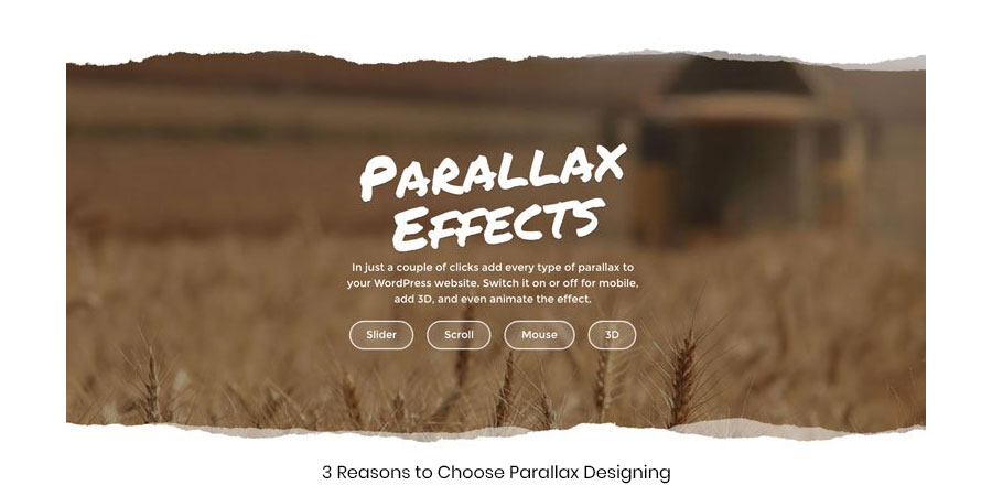
3 Reasons to Choose Parallax Designing
Before we give you reasons to choose parallax designing we will just give you an insight into what exactly is this concept about! Many a time while browsing a dozen websites you might have often noticed that the background moves a bit slower than the foreground content. This is your parallax scrolling. It gives you a 3D viewing experience which gets you hooked to the website for more. In recent times this technique has stolen the limelight from its counterpart and still seems to shine with all its might. It would be more apt if we say that this concept is here to stay at least for a bit longer than we could probably predict.
Here’s why you should go for parallax scrolling web design…blindfolded!
Reason 3->Engagement!
This could be one of the coolest reasons to choose parallax scrolling. When a user lands onto your website you could keep him engaged with this technique. When scrolling the user will actually get the illusion of a mystery unfolded or something exciting unveiling at every step. The more you keep your users engaged, greater are the chances of converting them into loyal followers of your website. It could help you out with storytelling, pushing users to click on the action buttons and keep them hooked to your site for more such surprises. With parallax, you can keep the curiosity levels really high!
Reason 2->Stand out!
We don’t literally mean that! With parallax scrolling, your website will actually stand-out-from-the-crowd! It will make your site look different and help break the stereotype designing of websites which has been held onto ages. Guide the users line of site, gradually navigate your users to the call-to-action menus, add more attention value to your website, build your website purely on user interaction and do much more with parallax scrolling. If you put everything in the right proportion then the UI will look even more awesome and the experience will be like never before.
Reason 1->The 3D effect!
If you want to make your website content look life-like then you go for parallax without a second thought. It does the trick without having to invest big time in materializing it. Instead of showing a 2D representation of the content, a 3D effect brings it one step closer to the life-like viewing experience. And parallax scrolling bags the award for its awesome 3D look and feel. No wonder designers are more inclined towards implementing parallax designs into their websites. When a 3D effect blends with minimal content the result is nothing but awesomeness!
So if still have a second thought on this then think twice. Your website might be losing out on great user experience!

In love with writing!
Jujubee media comes up with witty articles while including the pertinent information on what it’s best known for. We craft unique and credible content that helps in the best possible way to capture technological insights with ease!
- Tag:
- 3,
- Choose,
- designing,
- Parallax,
- Reasons,
